Node user interface elements
n8n provides a set of predefined UI components (based on a JSON file) that allows users to input all sorts of data types. The following UI elements are available in n8n.
String
Basic configuration:
 1
 2
 3
 4
 5
 6
 7
 8
 9
10
11
12
13
14
15
16
17
18 | {
displayName: Name, // The value the user sees in the UI
name: name, // The name used to reference the element UI within the code
type: string,
required: true, // Whether the field is required or not
default: 'n8n',
description: 'The name of the user',
displayOptions: { // the resources and operations to display this element with
show: {
resource: [
// comma-separated list of resource names
],
operation: [
// comma-separated list of operation names
]
}
},
}
|

String field for inputting passwords:
 1
 2
 3
 4
 5
 6
 7
 8
 9
10
11
12
13
14
15
16
17
18
19
20
21 | {
displayName: 'Password',
name: 'password',
type: 'string',
required: true,
typeOptions: {
password: true,
},
default: '',
description: `User's password`,
displayOptions: { // the resources and operations to display this element with
show: {
resource: [
// comma-separated list of resource names
],
operation: [
// comma-separated list of operation names
]
}
},
}
|

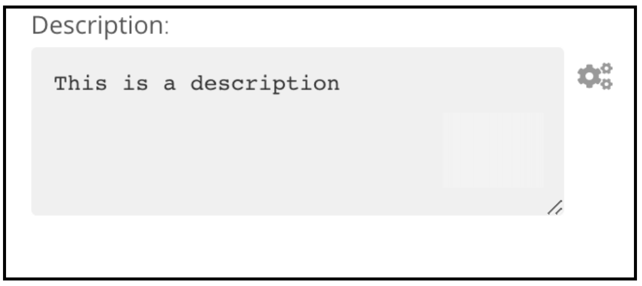
String field with more than one row:
 1
 2
 3
 4
 5
 6
 7
 8
 9
10
11
12
13
14
15
16
17
18
19
20
21 | {
displayName: 'Description',
name: 'description',
type: 'string',
required: true,
typeOptions: {
rows: 4,
},
default: '',
description: 'Description',
displayOptions: { // the resources and operations to display this element with
show: {
resource: [
// comma-separated list of resource names
],
operation: [
// comma-separated list of operation names
]
}
},
}
|
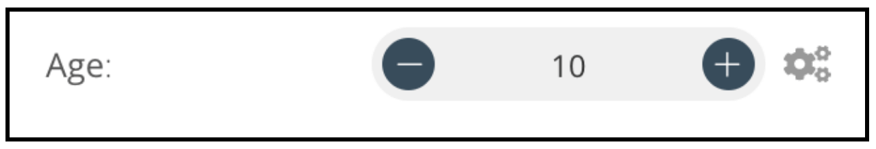
Number
Basic configuration:
 1
 2
 3
 4
 5
 6
 7
 8
 9
10
11
12
13
14
15
16
17
18
19
20
21
22
23 | {
displayName: 'Age',
name: 'age',
type: 'number',
required: true,
typeOptions: {
maxValue: 10,
minValue: 0,
numberStepSize: 1,
},
default: 10,
description: 'Your current age',
displayOptions: { // the resources and operations to display this element with
show: {
resource: [
// comma-separated list of resource names
],
operation: [
// comma-separated list of operation names
]
}
},
}
|
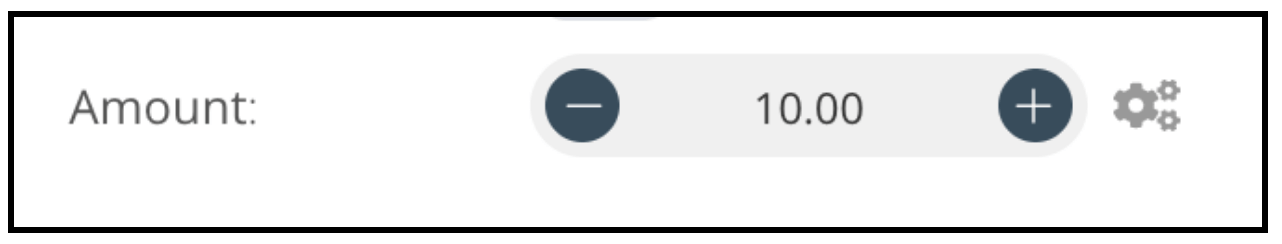
Number field with decimal points:
 1
 2
 3
 4
 5
 6
 7
 8
 9
10
11
12
13
14
15
16
17
18
19
20
21 | {
displayName: 'Amount',
name: 'amount',
type: 'number',
required: true,
typeOptions: {
numberPrecision: 2,
},
default: 10.00,
description: 'Your current amount',
displayOptions: { // the resources and operations to display this element with
show: {
resource: [
// comma-separated list of resource names
],
operation: [
// comma-separated list of operation names
]
}
},
}
|
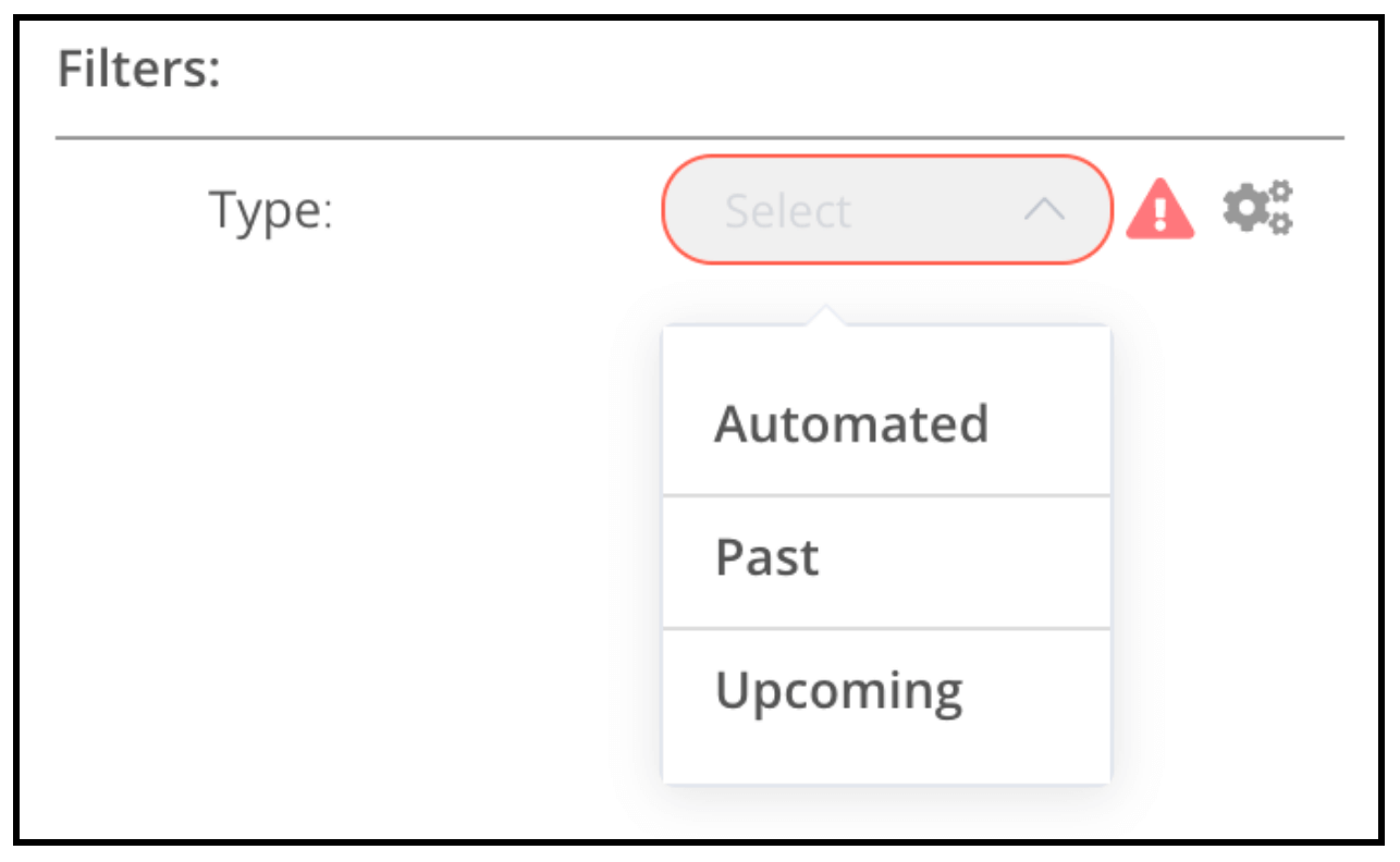
Collection
Use the collection type when you need to display optional fields.
 1
 2
 3
 4
 5
 6
 7
 8
 9
10
11
12
13
14
15
16
17
18
19
20
21
22
23
24
25
26
27
28
29
30
31
32
33
34
35
36
37
38
39 | {
displayName: 'Filters',
name: 'filters',
type: 'collection',
placeholder: 'Add Field',
default: {},
options: [
{
displayName: 'Type',
name: 'type',
type: 'options',
options: [
{
name: 'Automated',
value: 'automated',
},
{
name: 'Past',
value: 'past',
},
{
name: 'Upcoming',
value: 'upcoming',
},
],
default: '',
},
],
displayOptions: { // the resources and operations to display this element with
show: {
resource: [
// comma-separated list of resource names
],
operation: [
// comma-separated list of operation names
]
}
},
}
|
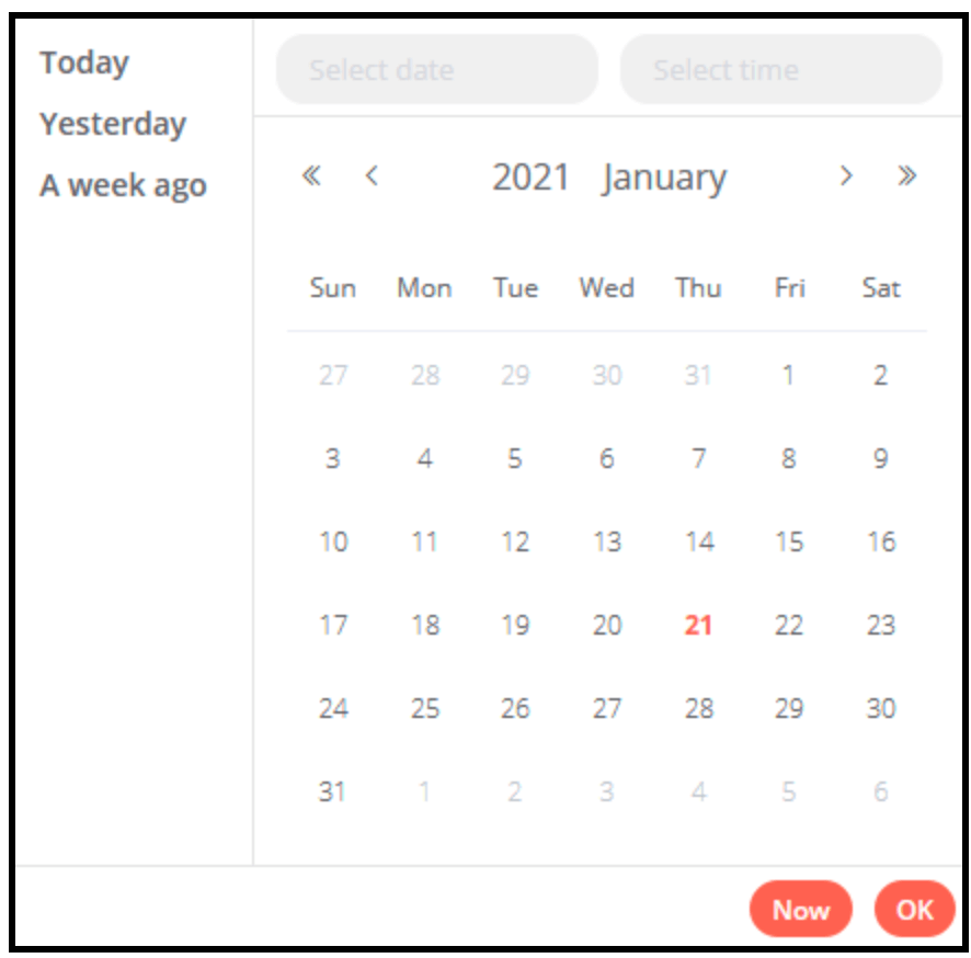
DateTime
The dateTime type provides a date picker.
 1
 2
 3
 4
 5
 6
 7
 8
 9
10
11
12
13
14
15
16
17 | {
displayName: 'Modified Since',
name: 'modified_since',
type: 'dateTime',
default: '',
description: 'The date and time when the file was last modified',
displayOptions: { // the resources and operations to display this element with
show: {
resource: [
// comma-separated list of resource names
],
operation: [
// comma-separated list of operation names
]
}
},
}
|
Boolean
The boolean type adds a toggle for entering true or false.
 1
 2
 3
 4
 5
 6
 7
 8
 9
10
11
12
13
14
15
16
17 | {
displayName: 'Wait for Image',
name: 'waitForImage',
type: 'boolean',
default: true, // Initial state of the toggle
description: 'Whether to wait for the image or not',
displayOptions: { // the resources and operations to display this element with
show: {
resource: [
// comma-separated list of resource names
],
operation: [
// comma-separated list of operation names
]
}
},
}
|

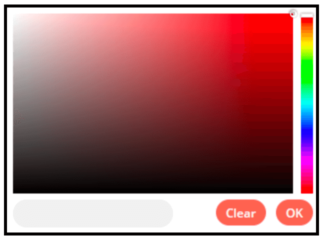
Color
The color type provides a color selector.
 1
 2
 3
 4
 5
 6
 7
 8
 9
10
11
12
13
14
15
16 | {
displayName: 'Background Color',
name: 'backgroundColor',
type: 'color',
default: '', // Initially selected color
displayOptions: { // the resources and operations to display this element with
show: {
resource: [
// comma-separated list of resource names
],
operation: [
// comma-separated list of operation names
]
}
},
}
|
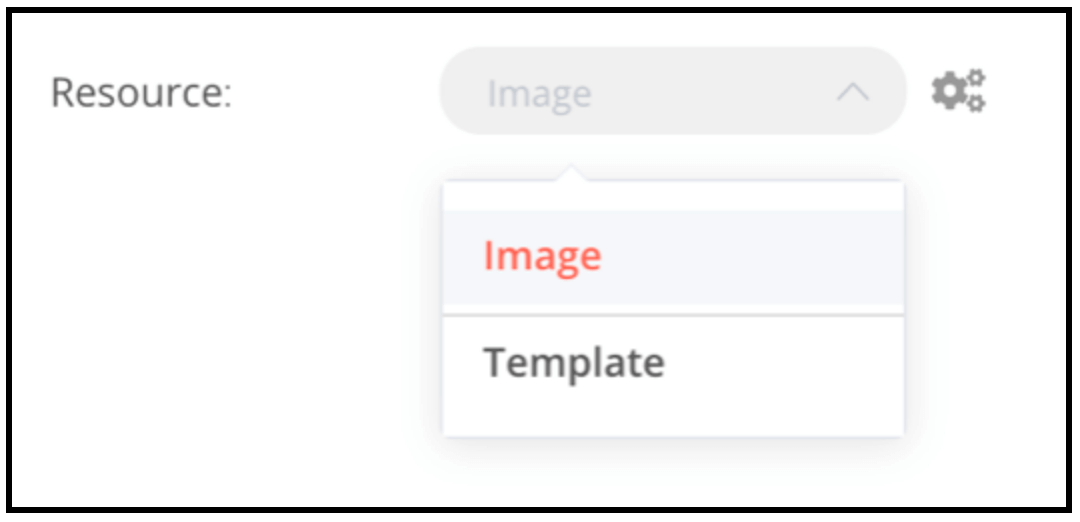
Options
The options type adds an options list. Users can select a single value.
 1
 2
 3
 4
 5
 6
 7
 8
 9
10
11
12
13
14
15
16
17
18
19
20
21
22
23
24
25
26
27 | {
displayName: 'Resource',
name: 'resource',
type: 'options',
options: [
{
name: 'Image',
value: 'image',
},
{
name: 'Template',
value: 'template',
},
],
default: 'image', // The initially selected option
description: 'Resource to consume',
displayOptions: { // the resources and operations to display this element with
show: {
resource: [
// comma-separated list of resource names
],
operation: [
// comma-separated list of operation names
]
}
},
}
|
Multi options
The multiOptions type adds an options list. Users can select more than one value.
 1
 2
 3
 4
 5
 6
 7
 8
 9
10
11
12
13
14
15
16
17
18
19
20
21
22
23
24
25
26
27 | {
displayName: 'Events',
name: 'events',
type: 'multiOptions',
options: [
{
name: 'Plan Created',
value: 'planCreated',
},
{
name: 'Plan Deleted',
value: 'planDeleted',
},
],
default: [], // Initially selected options
description: 'The events to be monitored',
displayOptions: { // the resources and operations to display this element with
show: {
resource: [
// comma-separated list of resource names
],
operation: [
// comma-separated list of operation names
]
}
},
}
|

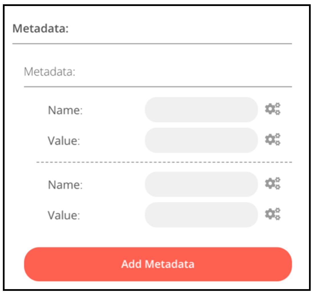
Fixed collection
Use the fixedCollection type to group fields that are semantically related.
 1
 2
 3
 4
 5
 6
 7
 8
 9
10
11
12
13
14
15
16
17
18
19
20
21
22
23
24
25
26
27
28
29
30
31
32
33
34
35
36
37
38
39
40
41
42 | {
displayName: 'Metadata',
name: 'metadataUi',
placeholder: 'Add Metadata',
type: 'fixedCollection',
default: '',
typeOptions: {
multipleValues: true,
},
description: '',
options: [
{
name: 'metadataValues',
displayName: 'Metadata',
values: [
{
displayName: 'Name',
name: 'name',
type: 'string',
default: 'Name of the metadata key to add.',
},
{
displayName: 'Value',
name: 'value',
type: 'string',
default: '',
description: 'Value to set for the metadata key.',
},
],
},
],
displayOptions: { // the resources and operations to display this element with
show: {
resource: [
// comma-separated list of resource names
],
operation: [
// comma-separated list of operation names
]
}
},
}
|
JSON
 1
 2
 3
 4
 5
 6
 7
 8
 9
10
11
12
13
14
15
16
17 | {
displayName: 'Content (JSON)',
name: 'content',
type: 'json',
default: '',
description: '',
displayOptions: { // the resources and operations to display this element with
show: {
resource: [
// comma-separated list of resource names
],
operation: [
// comma-separated list of operation names
]
}
},
}
|

Resource locator
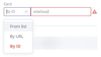
The resource locator element helps users find a specific resource in an external service, such as a card or label in Trello.
The following options are available:
- ID
- URL
- List: allows users to select or search from a prepopulated list. This option requires more coding, as you must populate the list, and handle searching if you choose to support it.
You can choose which types to include.
Example:
 1
 2
 3
 4
 5
 6
 7
 8
 9
10
11
12
13
14
15
16
17
18
19
20
21
22
23
24
25
26
27
28
29
30
31
32
33
34
35
36
37
38
39
40
41
42
43
44
45
46
47
48
49
50
51
52
53
54
55
56
57
58
59
60
61
62
63
64
65
66
67
68
69
70
71 | {
displayName: 'Card',
name: 'cardID',
type: 'resourceLocator',
default: '',
description: 'Get a card'
modes: [
{
displayName: 'ID',
name: 'id',
type: 'string',
hint: 'Enter an ID',
validation: [
{
type: 'regex',
properties: {
regex: '^[0-9]'
errorMessage: 'The ID must start with a number'
},
},
],
placeholder: '12example',
// How to use the ID in API call
url: '=http://api-base-url.com/?id={{$value}}'
},
displayName: 'URL',
name: 'url',
type: 'string',
hint: 'Enter a URL',
validation: [
{
type: 'regex',
properties: {
regex: '^http'
errorMessage: 'Invalid URL'
},
},
],
placeholder: 'https://example.com/card/12example/',
// How to get the ID from the URL
extractValue: {
type: 'regex',
regex: 'example\.com\/card\/([0-9]*.*)\/'
},
displayName: 'List',
name: 'list',
type: 'list',
typeOptions: {
// You must always provide a search method
// Write this method within the methods object in your base file
// The method must populate the list, and handle searching if searchable: true
searchListMethod: 'searchMethod'
// If you want users to be able to search the list
searchable: true,
// Set to true if you want to force users to search
// When true, users can't browse the list
// Or false if users can browse a list
searchFilterRequired: true
}
],
displayOptions: { // the resources and operations to display this element with
show: {
resource: [
// comma-separated list of resource names
],
operation: [
// comma-separated list of operation names
]
}
},
}
|
Refer to the following for live examples: